Linear's issue detail view: how a three-column split encodes your team's workflow
A teardown of Linear's issue detail panel — how the title-first layout, hover-only edit affordances, 16px status icons, and inverted-L navigation frame each make a deliberate bet about how engineers and PMs actually read and act on issues.

Open any Linear issue and you're looking at three panels: a narrow sidebar on the left, a list of notifications or issues in the middle, and the issue detail on the right. It feels obvious — but only in retrospect. Getting there required a specific set of decisions about what belongs where, what stays visible at all times, and what gets buried until needed.
This teardown covers the issue detail panel specifically: the right-hand column where issues live. That's where the density tradeoffs get interesting.
Information hierarchy: title first, metadata second
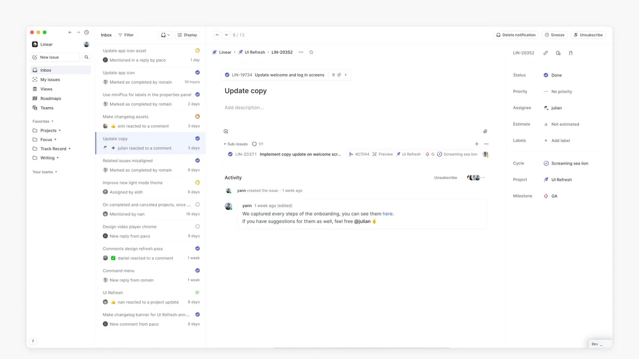
In the before state (the UI that shipped before the March 2024 redesign), the issue detail panel had its properties section embedded beside the title — status, priority, assignee, and estimate were inline, at the same visual weight as the issue title itself.
The new layout moves all properties to a right-side column. The title and description take the left. This is not just a cosmetic reorganization — it's an explicit claim that the title and description are the issue. The properties are how you file and route it.
That's a different information architecture than most project management tools, which treat status and assignee as co-equal to the title. Linear treats them as metadata — useful for filtering and sorting, but not what a reader needs first.
The result: when you open an issue to understand it, your eyes land on the title and body. When you open it to triage it, your eyes go to the right column. Two distinct reading modes, one layout that serves both.
Whitespace: the empty Add description field is doing work
Look at the issue body area — specifically when no description has been added. There's a faint
Add description placeholder where the content would go, and then nothing. No cards, no fields, no encouragement to add attachments. Just space.This is deliberate. The empty state signals that the issue can have a description without demanding that it does. It puts the burden on the user's intent, not on the interface's insistence. Compare this to Jira's issue view, which fills the empty description zone with a full rich-text editor toolbar, a template chooser, and a formatting guide. That approach communicates "you should write more here." Linear's approach communicates "write here if it helps."
The second effect of this whitespace is that when a description does exist, it reads as primary content — a focused document rather than one input field among dozens.
State changes: how Linear uses color to encode urgency without shouting
The status icon on each inbox notification is the most compact information display in the product. A small colored circle (no text) represents the full state machine:
- Gray empty circle — no status set / unstarted
- Orange half-fill — in progress
- Blue checkmark — done / resolved
- Red ring with x — cancelled
These icons appear at 16×16px in the inbox list. At that size, text is unreadable. Color plus shape is the only viable encoding. What's notable is how Linear keeps these icons consistent across the entire product — the same icons appear in the sidebar's issue counts, in the sub-issues section within a detail view, and in the breadcrumb trail at the top.
That consistency is the payoff of a controlled icon vocabulary. Once you've learned that a blue checkmark means done, you read it instantly everywhere — you never have to re-decode it in a new context. This is what the Linear team calls "perceptual efficiency": the interface teaches you once, then gets out of the way.
Micro-interactions: the properties panel hover pattern
The properties column on the right of the issue detail shows Status, Priority, Assignee, Estimate, Labels, Cycle, Project, and Milestone. In the previous design, all of these had visible edit controls at all times — dropdown arrows, buttons, clickable chips.
In the current design, the controls are hidden by default and revealed on hover. You see "Done" next to Status, not "Done ↓". You see "julian" next to Assignee, not "julian ✏️".
This is a consistent pattern in Linear's interaction design: treat the default state as read mode. Only show edit affordances when the user signals intent by hovering. The tradeoff is discoverability — a new user might not know that "Done" is clickable. The bet Linear makes is that the users who need to edit these fields have already learned how. The interface optimizes for the experienced user who is deep in a flow, not the curious new user who is exploring.
You can see the same pattern in the sub-issues row, the labels field, and the Cycle field. The
+ button and the ··· overflow menu appear only on hover. Everything else recedes.The structural decision behind it all: inverted-L navigation
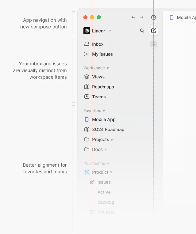
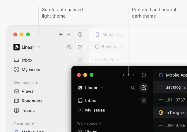
One thing that makes the issue detail possible is the fixed navigation structure. Linear uses what its design team calls an "inverted L" frame — a persistent horizontal top bar and a persistent left sidebar, with the content area filling the rest.1
This frame never moves. When you go from Inbox to My Issues to a Roadmap, the sidebar and top bar stay fixed. The content area swaps. That stability is what allows the three-column split within the issue detail to feel readable — you already know where you are in the product, so the detail view doesn't have to re-orient you.
The March 2024 redesign made this frame more explicit by running an alignment pass on every icon and label in the sidebar, maintaining three consistent vertical columns (icon column, label column, badge/count column) across all hierarchy levels.
What PMs can take from this:
Information hierarchy in your own specs should mirror what Linear does: separate what something is (the title, the description) from how it gets processed (status, priority, assignee). When these get conflated — when status and title compete for visual weight — readers burn cognitive load on triage rather than understanding.
The hover-to-edit pattern is worth borrowing in design reviews. When your mockup shows controls that are always visible, ask whether each one earns that permanent space. If the answer is "users need to know it's editable," the real question is whether the feature needs better onboarding rather than more chrome.
이 콘텐츠를 둘러싼 관점이나 맥락을 계속 보강해 보세요.